Logo rebranding for Ukrpol: work process in detail

This text is about the process of creation of the logo for the publishing house Ukrpol. We'll describe the entire way of rebranding creation with graphic samples at all stages of the development.
Why update the logo?
Over 23 years of existence, Ukrpol has grown from a format of rapid printing house to one of the leading printing companies in Ukraine. The company has also grown out of its previous identity throughout these years. Thus, it was necessary to modernize the brand in such a way as to reflect a constant process of development. The rebranding has become the next step in its evolution.
We involved Kyrylo Tkachov, the author of fonts, logos, and the organizer of the international festival of calligraphy and design "Prostir liter" in the process of logo development.
What's wrong with the old logo?
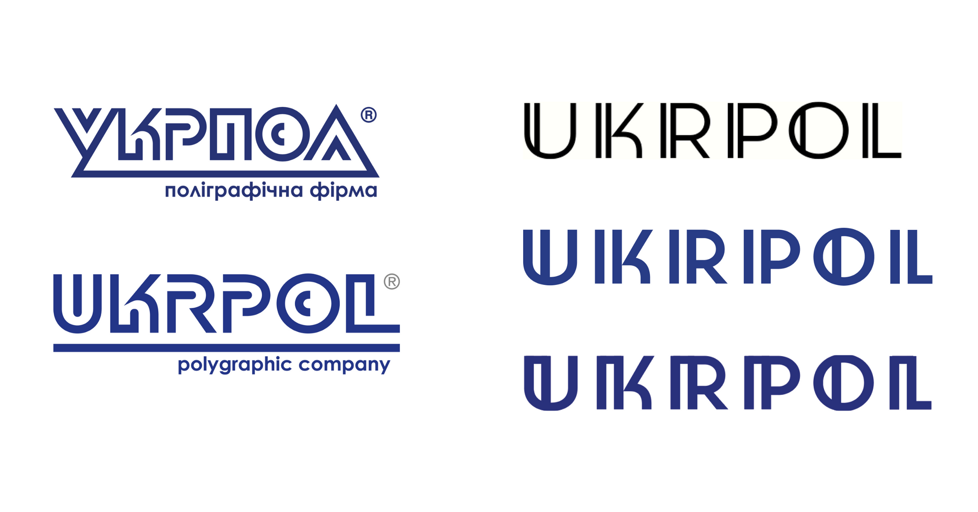
In short, it is poorly readable. In addition, it has an outdated visual solution.
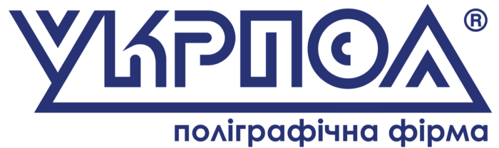
We found several trouble spots:
- The letter shapes are geometric but difficult to perceive. They look like a puzzle.
- The distances between the letters are small, so it is uncomfortable to read them. The logo is seen more as an image of a labyrinth than as text.
- The style of the logo appears aggressive due to a large number of sharp shapes.
- Underlining the text doesn't play a significant role but distracts attention.
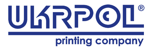
The English-language logo has adopted some of the problems of the Cyrillic.
- The letter shapes are geometric but difficult to perceive and read.
- There are three types of line completion readable - straight, rounded, sharp.
- The logo style is a bit broken due to many different shapes.
- The logo is read-out non-inherent elements: the copyright mark ©, a decorative spiral-meander, the letter "C."
- Underlining under the text does not play an important role. It distracts attention and puts pressure on the descriptor.
Challenge
The old version of the UKRPOL logo is recognizable and has its style. Thus, creating a logo that would "stay within," not invent something extra new is necessary. The points of contact of the logo and corporate identity carriers with the target audience will be online and offline. Specifically, the new logo will appear on the website, letterhead, printed materials, banners, and electronic signatures.
Proposals and first steps
Kyrylo Tkachov suggested keeping the resemblance to the previous version of the logo:
- The geometric shapes of the letters. However, make them more readable.
- Doubled lines, but reduce their number.
- Writing in capital letters.
- Moving the descriptor to the left side because the reading direction is from left to right.
Work process
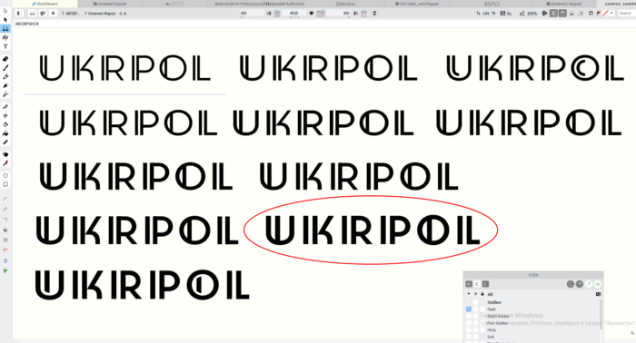
The first attempt kept the similarities with the old version of the logo. We preserved the idea of doubling the lines inside, particularly in the letters "U" and "O." The other lines were moved as additional elements, giving a rhythmic effect. At the same time, there was a feeling of possible difficulties in reading.
Then we made drafts of the version with a descriptor. The element informs about the core business of the company. At the same time, we "played" with colors.
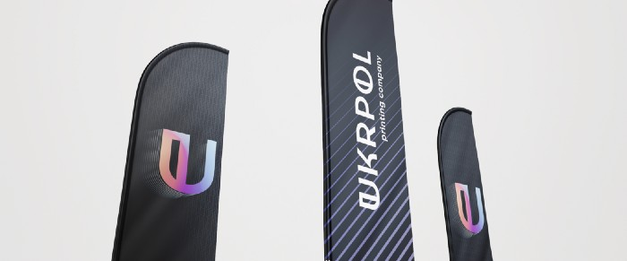
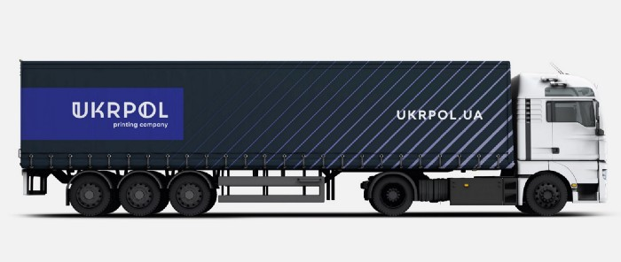
We have also prepared examples of real-world usage of identity for illustrative purposes.
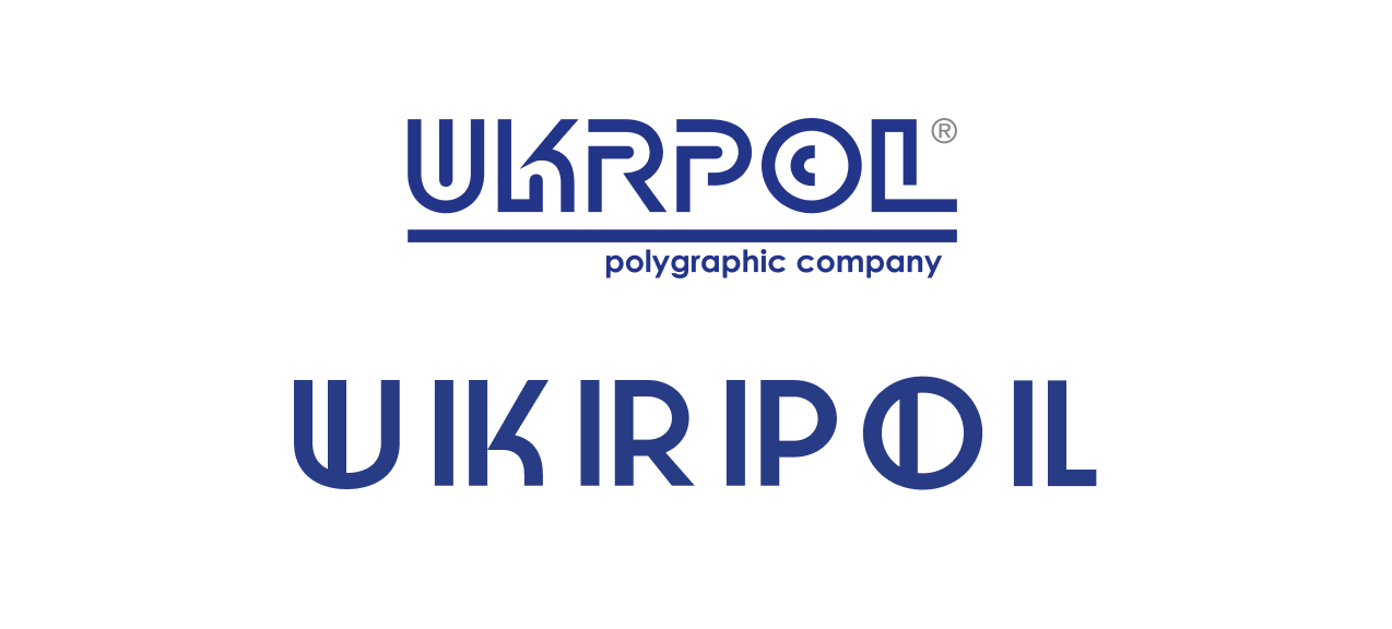
We coated the letter mark on top with a connective element from the beginning, as it lost readability and became like a pitchfork as it shrank in size.
The client rejected the first version of the logo because of difficulty reading it. Indeed, additional lines appear as separate "I" letters, and the company name sounded like "Uikirpoil" instead of "Ukrpol." We agreed, denied this version, and moved on.
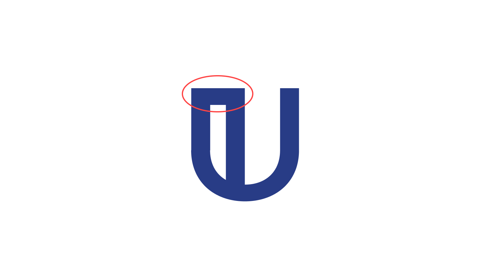
During one of the online calls, Kyrylo Tkachov added some upper connecting elements for the letters.
Compare the old versions of the logo and the first attempts to develop a new one:
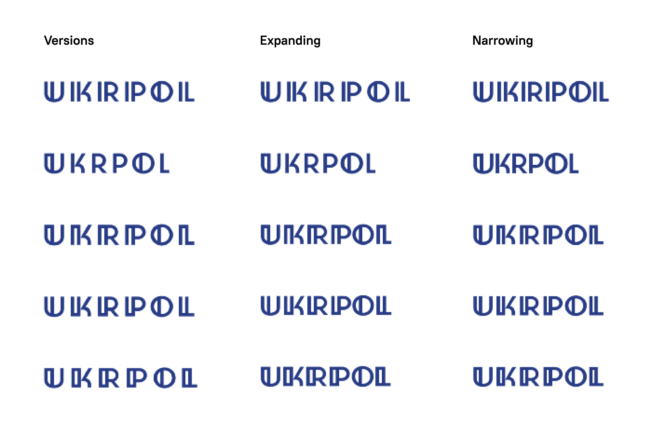
The client liked the variant with less distance between the vertical lines, so we worked with it from now on.

Playing with readability, changing the indentation and elements of the logo.
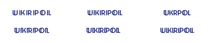
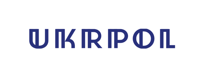
Let's take a closer look at them. Below is the original offer refused by the client.
The same version, but with reduced distances between doubled lines.
The following version is a compromise between the old logo and our first version. We removed the additional vertical lines and combined the "U" vertices.
Then we tried adding spacing between the letters, but we lost the integrity because of different thicknesses.
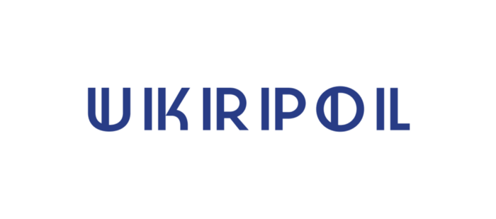
The binding elements on top allow for a better perception of the letters, even if approaching one to the other.
Adding the spacing between the letters makes the readability worse.
In this version, the letters are readable, but they look pretty rough.
The sentence with the bottom binders allows the letters to be closer but makes the logo look too spiky.
As with the previous versions, they become tougher to read when the spacing between the letters.
Comparison table of versions:
While the client decided what he liked best, we worked on the descriptor by selecting a font.
We settled on the Gilroy font. In the meantime, the client chose the high-priority version, but it needed some fine-tuning.
Kyrylo Tkachov kept the tracking but changed the width of the letters.
Regarding the position of the descriptor, we suggested placing it to the left. But the client insisted on setting it to the right because "it's more familiar that way." In this case, the text should be in lower case.
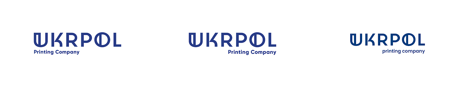
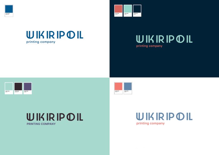
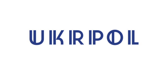
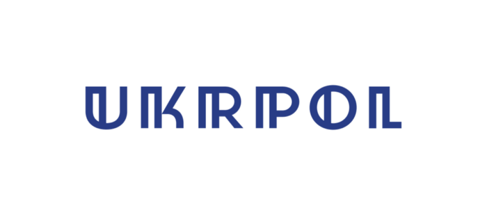
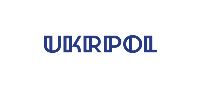
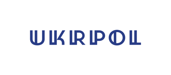
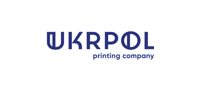
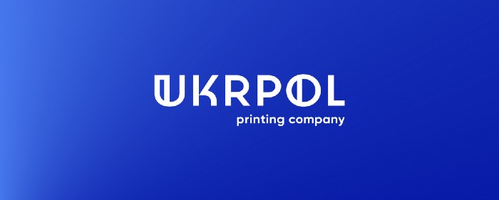
The final version of the Ukrpol logo is in the correct Pantone.
New logotype and its elements. Details
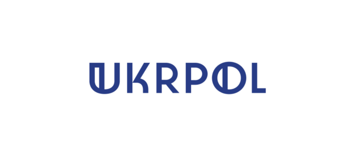
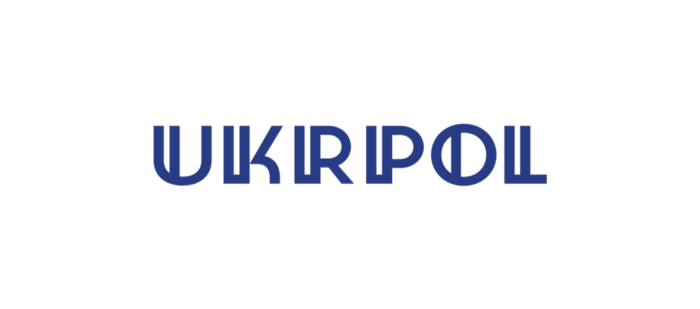
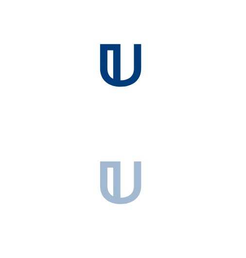
The new logo has a minimalistic form of the iconic part, resembling the old mark. The next part is concise, understated, and humanistic. A simplified version of the logo without a descriptor.
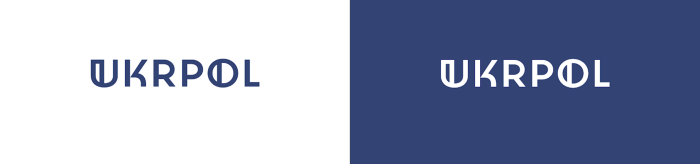
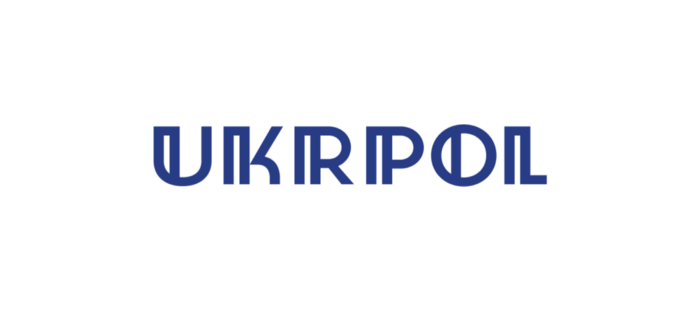
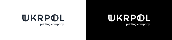
Monochrome versions serve in cases where color reproduction is not possible. They are easily recognizable and stand out on different backgrounds and surfaces.
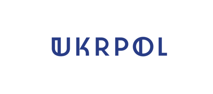
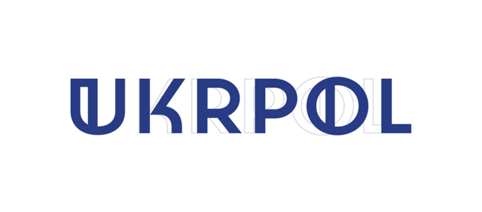
The letter mark is almost the same as we created it at the beginning of development.
The logo doesn't exist apart from the brand
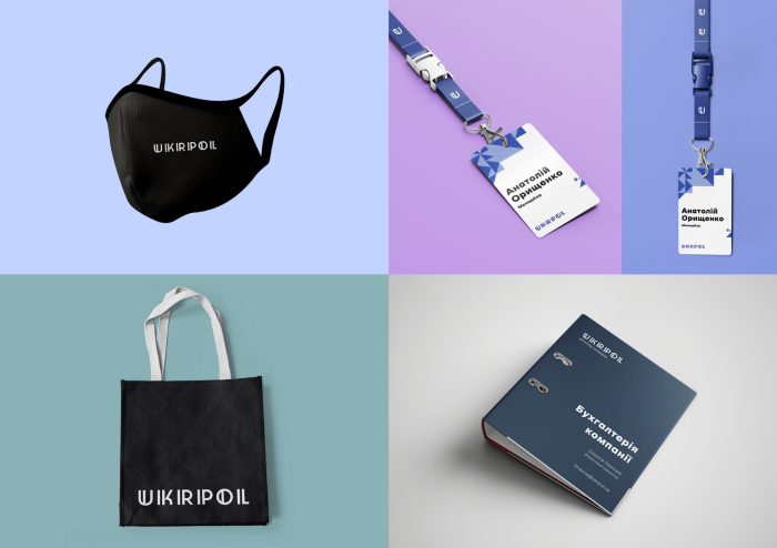
With our logo guidelines — color palettes, fonts, and recommendations for scaling and placement — we provided the client with instructions on using the logotype. Thus, all subsequent participants in the brand development process will receive clear instructions on using the created graphics properly.
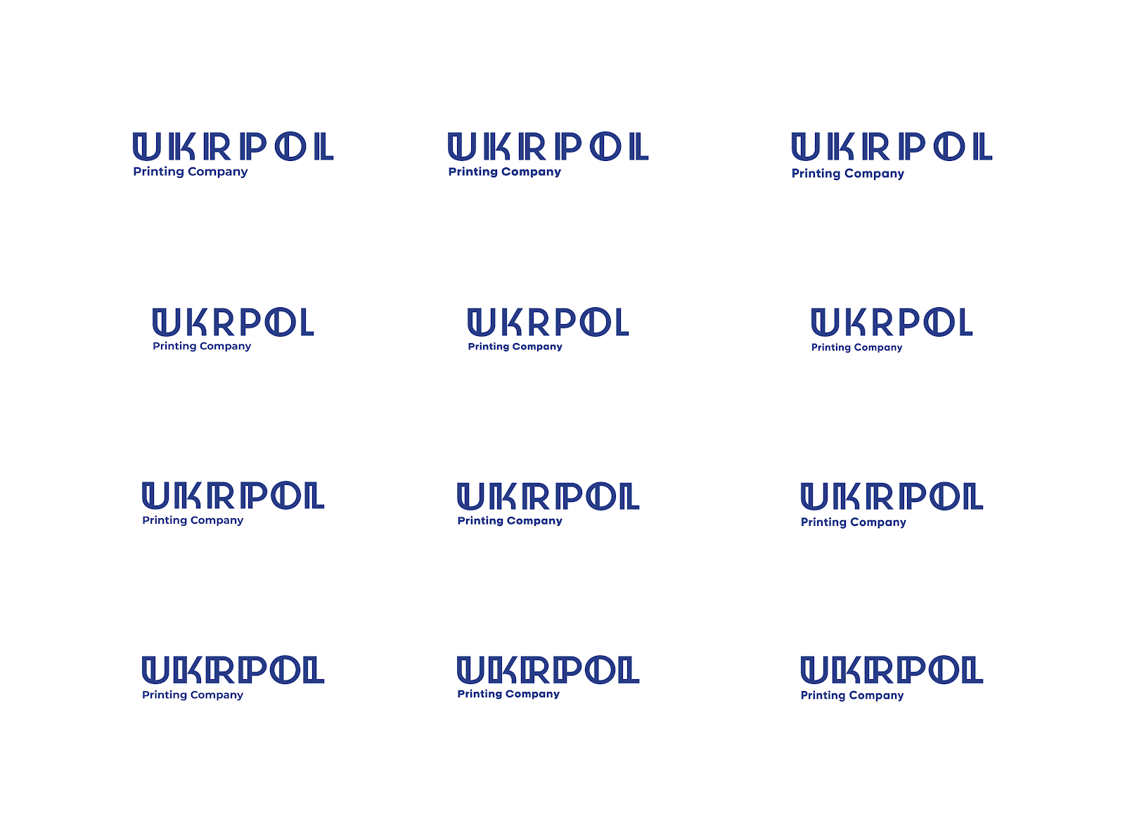
The new logo usage examples
Afterword
When a brand confirms the development orientation through its history and activity, its logo should also reflect this. We are sure that the new Ukrpol identity has achieved this goal.